

Pharaoh’s Purse: Video Game UI Redesign
Improving Accessibility and Usability for an 8-bit Tower Defense Video Game
Case Study by: John Lattanzi
10/14/2020
Overview:
Project Summary:
The task was to redesign the UI of an existing Tower Defense game called Pharaoh’s Purse. The team’s goal was to use their existing pixel artwork and aesthetic vision while improving the accessibility and usability standards to create a better user experience. This process involved 3 week long sprints that created new UI that was both consistent with their current style guide and that showcased quantifiable improvements to the accessibility and usability of the game. Due to this, we increased their demographic size, made the game more fun to play and easier to learn, and moved our focus to increasing player retention.
Client: Indie Game Developer, Hannah Kirzinger of MemeRegime
Product: 8-bit Style Tower Defense Game - Pharaoh's Purse
Dates: Sept. 21, 2020 - Oct. 09, 2020
Methods: Agile: Sprints, Kanban
Tools:
Figma
Zeplin
Photoshop
Sketch
Maze
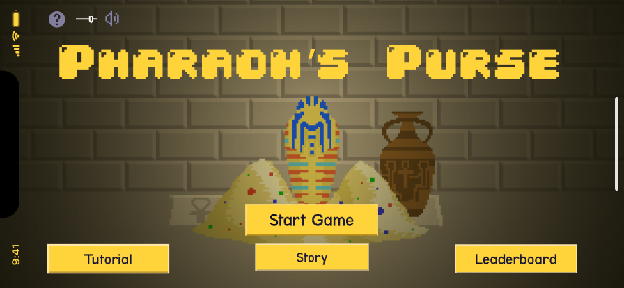
On the right, it is showing you a gif of what the original gameplay looked like. Below that, I included a gif of what the screens we made look like now.
My Role:
Content and Storyteller Lead, UX Researcher, and Visual Designer
Responsibilities:
UX Researcher
Facilitated User Interviews
Crafted User Surveys
Managed the process of crafting heat maps to better test for usability
Created personas, empathy maps, and journey maps
Tested for accessibility standards
Content and Storyteller Lead
Managed all Story Screens and crafted new Tutorial screens
Worked with the pixel artist’s designs to maintain the look and tone of the game
Presented all findings
Built screens focused on clarity (wave cleared, game over, etc.)
Implemented indicators to Tutorials
Visual Designer
Crafted interactions between pages
Redesigned story screens, tutorial screens, and game overlays
Created moodboards and ideated on new designs for the client
Problem Statement:
Our goal was to provide players with a reliable way to navigate through the game, understand the story behind it, and how to play it. The original interface was hard to read and it was very difficult to understand what the players’ goals were.
Business Requirements:
MemeRegime's requirements were for us to create a more usable and accessible player experience. Specifically, they wanted to implement a more in-depth tutorial, draft overlay help cards for gameplay screens, and a complete in-game UI redesign. Outside of that, they wanted to see what we came up with to improve the gameplay experience for users.
Core Demographic:
Late teens to late 30’s
People who played desktop games
User Needs and Pain Points:
To improve the user interaction, we need a more clear explanation of game mechanics, to alter the typography to focus on legibility and clarity, and to redesign user flows to better match game play and avoid hitting dead ends within the game.
Through user testing, these were the largest pain points we found:
Low color contrast
Font was very difficult to read
General inability to understand how to play, how to win, and how to lose.
Platform:
Windows desktop and Steam are the main platforms they’re using, but we spoke briefly about the possibility of a web-based game and a mobile game in the future.
Technical Constraints:
The developers built blocks of code that could not be separated
The pixel art had to be maintained
We had three-weeks to meet the client’s requirements.
Business KPIs:
The KPIs we used to measure success were accessibility testing, accessibility standard metrics, and heat-map data. These all boiled down to the question:
How might we make Pharaoh’s Purse more accessible and usable for all players?
Research:
Our initial research consisted of a screener survey, a usability test of the original game UI that functioned similarly to a contextual inquiry, and a follow up interview. Following that, we developed personas, created a journey map, and created an empathy map based on that information.
Our screener survey was used to weed out participants who did not fit the specific demographic we were looking for: different age groups and people who didn’t play computer games often.
After we narrowed our participants, we developed a research outline and began conducting tests. We led them through three scenarios:
Read the story page
Play through the tutorial
Play through 5 levels of the first map of the game.
These scenarios were selected to test aspects of the game we knew to be issues and within our client’s business requirements to fix and to see the extent of the pain points for the users.
After the usability test, we conducted follow-up interviews with the participants to understand their perspectives and begin ideating solutions. Some key findings we found were:
There was serious difficulties with text readability, which fostered a lack of game understanding
Learning how to play the game was not intuitive and broke mental models
The tutorial was not easily able to clarify how to play, which posed serious issues with game enjoyably for players unfamiliar with tower defense games
The usability issues led to less gameplay enjoyability
We also learned that despite these problems and a general lack of understanding, many players still thought the game was enjoyable and addictive. This gave us hope that as we implement changes, we’d be able to make the game just as enjoyable for the players who got lost during the less accessible parts of the game.
Personas:
Then, we developed two personas that represented both sides of our demographic, including pain points that would align with frustrations of the game play. Specifically, the first persona, Danny, has a visual disability that directly represents one of our usability test participants, which allowed us to refer back to visual accessibility as an essential focus.
Journey Map:
Following the development of our personas, my team created a journey map in which a gamer is looking for a new gaming experience and is recommended Pharaoh's Purse by a friend. This gave us the perspective of how they would find the game and how to foster player retention.
Empathy Map:
Then, my team made an empathy map to put us in the headspace of our users so we could connect with them and appreciate their frustrations. We utilized this as we began to ideate.
Storyboard:
As we began to ideate, we wanted to consider another way someone may find Pharaoh's Purse and what aspects of the game were unique and intriguing enough to decide to play. We did this in order to see what drove users to this game so we could foster better player retention.
User Flow Updated:
Then, we created a new user flow. To do so, we iterated off the existing game’s user flow. The new version now had a more complex understanding of the functionality of the game and included room for errors and how to avoid dead ends within the game.
Sketches
In this portion of our ideation process, each member of my team took time to sketch how we foresaw solving the UI. These are the sketches I did:
Voting Chart
The team then implemented a voting chart to make decisions on and to make sure everything remained fair. Fortunately, we agreed on most issues and we ended up finding it quite easy to select a direction for our design and move forward with it. Listed below are some of those ideas:
Solution Sketch
This solutions sketch is what we came up with as a team for the direction of what we want the gameplay screen to look like.
Wireframes
Then, we started wireframing with the goal of meeting the client's requirements and working to improve the pain points we discovered during our usability tests.
Paper Prototype
As our wireframes came together, we shifted our focus to think about the interactions taking place within our client’s existing coding constraints. After many meetings with our client, we were able to make realistic changes and created this paper prototype to showcase that.
Prototype V1 and V2:
After our paper prototype, we moved to make it digital. In our initial iteration, we moved away from the elements of our client's existing style guide. However, after a discussion with them, we agreed to go back to utilize more of their existing pixel artwork. Then, we iterated and began to adapt and edit their design kit to suit necessary changes.
Final Prototype:
Eventually, through many iterations, constant reference to our research insights and personas, and team collaboration, we came to our final prototype.
User Tests Part 2:
Then, we wanted to run a usability test with the same participants from earlier to see if we improved their pain points. However, we had to make some changes to the scenario because we were now testing on our clickable prototype, so the participants couldn’t utilize gameplay. We were, however, able to gather valuable A/B test data.
Our results showed that all the participants were able to identify improvements in each category we were focused on, some even verbally expressed greater satisfaction in the UI. While the words of affirmation provided qualitative validation for our design and made us feel good as a design team, we also wanted to find quantifiable evidence.
Data Analytics:
To gather that quantifiable information, we used the Maze analytics program. The participants for this section were looking at the game for the first time and tasks with following certain “mazes”. From this, we gathered heat maps that helped to quantify our improvements.
Conclusions and Future Recommendations:
As a team, we then presented our final prototype to MemeRegime and they really enjoyed the improvements and confirmed we had met their requirements. To end our meeting with them, since we were on a time crunch, we decided to provide a list of future recommendations. These recommendations focused on upping future game retention through more user interaction.
Add a story mode, give the users something to come back to over and over again
Add in a health bar for enemies so you know how much more damage to cause
Make the area of effect indicators more clear
Feature a mobile port
Implement more gamification to increase user retention
Example of those changes:
For example, this is what the game might look like as a mobile game.


Takeaways:
Through this project, I learned a great deal about an area of design I never thought to explore. Game design was a really intriguing modality to learn through and it provided a great avenue to learn about other areas that need UX help. This project surrounded making the gameplay more intuitive to players, more accessible to everyone, and to make the experience something that people will come back to. I truthfully learned so much about the way people interacted with games and how to foster user retention, I wouldn’t change this experience for the world.
Additionally, I learned quite a bit about how to better work with a diverse team. Most of my team members had never worked together and we all have very different ways of working. This taught me about the importance of team communication. Getting to know and understand your teammates and their working styles is key and I learned a lot about communicating more efficiently and managing disagreements between team members. I believe this knowledge will be really useful as I take the next steps in my career.